Monday, May 28, 2012

Curved Dagger Version 0.2


This was my 2nd attempt on the dagger after gaining some more insight with the tutorial from chapter 2 and 3. This time I was able to set up the image plane, I found out how to do this by googling it and finding some cool, free videos on digitaltutor.com. I open my 4 window view and toggled onto the front view, then I opened the view menu and selected import image plane. I also learned how to shut off the image in the other views so I could see around the picture. The first time I really messed up because I tried to use and image that was slanted and doing it this way made my model come up lope sided.


SO I went back to the internet to see if I could find a different image of the same dagger. Luckily through some digging I found multiple images of dagger like the first one I had. I decided to use a picture of the dagger which was lying straight up and down; this made lining my model up on the grid easier. This time I tried to stick as close to the design as I could and moved all the vertices of my model to the outline of the picture. I later extrude several areas inward and outward to create the necessary appendages and indenture for eyes and wing flaps. This time I went back and cleaned up some of my lines to my topology cleaner, and more balanced. This time I was careful not to delete in the places, I also used the merge vertex tools to get rid of some unnecessary face and edges, as well. 


Intro. Autodesk Maya 2012: Chapter 2 & 3


These chapters were pretty straight forward. Chapter 2 taught us how to create a solar system and animate it. By doing so we explored the different menus in Maya and familiarized ourselves with animation basics and modeling basics. I learned a lot about channels and attribute menus and how to manipulate them to get precise results. In chapter 3, we explored these concepts further but concentrated on modeling, as we constructed a toy box for this tutorial. This section taught us a technique on setting up image planes (I later discovered a different way after some digging on the internet), and also how to manipulate primitive forms.


Saturday, May 19, 2012

Project 2: Curved Dagger


On my second project I chose to model an asymmetrical dagger, which had small spined wings and a bat face on the handle. I took some time just staring at my reference, deciding on how I should approach crafting it. My first thought was that the overall shape resembled a long flat rectangle. So I began with a long flat rectangle and began to partition it into manipulable faces. I did this by using the edge loop tool and interactive split tool, first forming the faces for only the handle. I switched over the smooth mode, in order to see where exactly to stop the handle, because I wanted the over end to maintain a certain sharp point.

Now that I had my “clay” set up for molding, I chose to concentrate forming just the handle. I molded out the top notch of the dagger by selecting the faces at the top of the handle and extruding them. I then moved the notch down somewhat in order for it to cup the top of the handle. After that I selected the part for the hand grip where there were small etchings of rope onto the dagger. I noticed that there was a swoop in the shape of it and the handle became thinner on the way down to the blade. I tried to imitate this by scaling down certain sections of the handle at a time. I later came back to the handle, and extruded out some sections to give the handle more of a textured surface; just in case I want to come back and texture in those etched ropes on my ref image. The bat wings were actually the second thing I focused on in this project. It took me a very long time and a couple of re-tries and mishaps to get them to a point that I was satisfied with.  I basically sectioned out a piece of the handle at the bottom, and then on each side I selected one square face and extruded them outward, it started to look like power ranger sword.

  Then at the end of these “spokes” I sectioned off another small face with the edge loop tool, and pulled a square face out on the bottom of both of the “spokes”. Then it began to resemble something like a ninja weapon. I then grabbed the inner faces of both of my newly form prongs and extruded them out somewhat to form the webbing of the bat wings.  This formed some problems with the joints, and malformed them though. So I ended up deleting those faces and then making a bridge between the detached wing and the dagger handle. Later I came back and added more edge loops onto the wings and selected the faces in between them and extruded them to give them some inner spines. I also took the faces opposite to those and scaled them inward to make the spines more pronounced. I also took the very tips of the wings and moved them up and in somewhat to give them more of a rounded wing.

 The blade was my next endeavor. At first, I thought it would be simpler than the handle, but I did end up hitting a few snags that I tried to work around, such as the notch in the center of the blade, and maintaining even-ness of the blade itself.  I started by sectioning off the top part of the blade with the loop tool, leaving the bottom alone because I wanted to keep that point. I then added two loops vertically, in the center of the other edge loops I had made to section the blade. The faces in-between these vertical lines I pushed inward on both sides in order to form the notch.  I later ran into problems with this when I later thinned out and curved the blade by pushing sections of it in opposite directions. I went back and cleaned up some of my lined with the delete lines and vertexes tool. Finally getting the shape I was satisfied with I cut out a circle next to a smaller circle in the center of the wings, and extruded the faces of that outward forming the bat skull. I also deleted one line from the base of the skull to make the rise smoother. Finally I went back and carefully re-sized my handle and blade to about the same size as my ref image.


Thursday, May 17, 2012

Project 1: Thor's Hammer


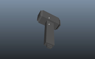
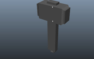
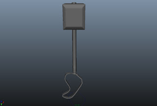
My first project with Maya was very enlightening and fun. At first I had a lot of problems because I wasn’t too familiar with the basic tools. This was my first time with Maya so I made a lot of mistakes, and ended up starting over again a few times. After my final attempt on the Hammer though, I feel somewhat comfortable with the controls, and I’m excited to see what I can accomplish on my next project (A dagger) with what I’ve learned. 

My First attempt hit a lot of snags. I couldn’t remember many of the tools, but after poking around each of the menus, and remembering to switch my toolset over to the polygon set; I found most of what I needed. I began the first hammer with just a simple cube. It took me a few times to get the cube just the size I wanted, so I began using the scale tool to changed its shape to somewhat fit the size of my reference images. Once satisfied with the result, I went onto using the edge loop tool in order to start dividing my cube in manageable surfaces. I wasn’t familiar with the interactive splitting tool yet so I couldn’t figure out how to make any round surfaces to be later extruded out from the main cube. So I ended up just pulling out a square shaped nub from the top and a very blocky handle at the bottom; by right clicking, selecting Faces, and then highlight the faces I wanted to use the extrude tool on. I shaped a smaller strap holder onto the bottom of the handle. I also attempt to make the strap, but only got as far as, making the shape for the strap and making the cv curve line. 


My second attempt was in the middle of class. I did get much farther on this one, and I learned a whole lot more about the smoothing, edge loops, and interactive splitting. I hit a couple of snags when it came to merging, but I figured I could work around that later on my 3rd attempt. I learned how to line up seams from my mishaps though. 

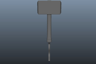
Front


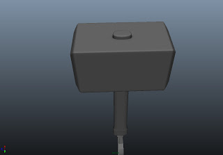
I began my third hammer attempt with a simple cube, like I had done in the first attempt. Now that I had more knowledge about the edge loop tool and the smooth hot key, I had a better idea of where and how to place my grid lines in order to get maximum sharpness but less polygons. I tried using the “multiple lines” option in the edge loop menu, but I didn’t like how much it divided it up so I did most of it by hand. I then began cutting out the top notch of my hammer with the interactive split tool. This time I was able to form a circle, but the grid line went a little wonky, but I added “supports” around it to maintain shape. Once done with that, I began to individually select the lines and tweak them even further to get a better circle. Then I used the extrude tool and pulled the middle out. I later went back and added two more edge loops, and took the loop nearest the hammer and pulled that seam into the hammer to make it look like the notch was going through and coming out the top of the block. I used a similar technique when I was forming the handle. I cut out a circle and then extruded the inner edge out and took the outer edge and pulled it into the hammer to give it the same effect as the top notch. I added a few more edge loop to the top, middle and bottom sections of the handle. I then selected the very bottom of the hammer and scaled it out somewhat, creating a small pommel at the bottom. I then took the top edge of the pommel and extruded it outward, making the pommel look more like a metal cover in my opinion.  I then began working on the strap holder; I split the faces on the bottom of the pommel up into smaller pieces, and then extruded the portion. Then I added more loops to it make the holder straighter, and less round. I then cut out the middle which made the side warp out. I wasn’t sure how to fix this. But I really like the effect it had on the holder ring.


 Finally I made the strap; first I made a small flat cube, and then made a strap path with the cv curve tool. I lined up both pieces with the holder and then selected one face on the side of the cube and the cv line, and clicked extrude, I then added more segments until the strap was smooth looking. I then selected one face on one side of the strap and the other face on the other side of the strap, and bridge them together with the bridge tool.


Tuesday, May 8, 2012

CG Galleries and Tutorial sites


Amanda Torres
Professor Tyrus Goshay
Modeling I
 May 8, 2012
CG Galleries and Tutorial sites


The links above are taken from a website called 3D Total. 3D Total is a CG based community. They have a forum for artists to discuss their projects and seek help and advice from other professionals. They also offer free textures, and reference images. They also have an extensive gallery, where artists can post recently finished projects to be critiqued by their peers. The links number 2 and 3 are direct links to pictures that immediately caught my eye. They are both of hard surface characters; one is an iron woman and the other in a robotic alien. I really liked them because they both had very cool and sleek designs to their “exoskeletons”. The alien head, especially, had many small difficult details.
----------------------------------------------------------------------------------------


The links above are to a website called, CG What. This is a website that also focuses on digital and 3D art. This site offers several different video guided tutorials, and also a few useful downloads. I choose three tutorials that sound like they would become useful to me sometime soon or in the future. One tutorial I choose was to create a very details zombie head using the Zbrush program in junction with Maya. This tutorial was a little more advanced than the beginning tutorials. A cool beginner tutorial I find on this site was to construct a zombie bunny. Like all tutorials on the site, this one is video guided and the result is a large grotesque rabbit. The third tutorial I picked out was one that teaches how to create texture and uv for a previous tutorial involving a simple snail character.
----------------------------------------------------------------------------------------


The links above are to CG Art World. Although it is a CG based art website, it does not have anything other than large and well organized galleries. CG Art world has categories ranging from interior design, to creature and vehicles. They also showcase 2D art in their anime girl section, and icons. The three piece of art I choose from this site were taken from the cg girl section, the mech section and the creature section. I choose them because I thought they all had unique qualities to them. For example the mermaid that I took from the CG girl section has a very beautiful design from hair tentacles and also has a very delicate design on the buckles on her clothing. Also the lighting by her hand makes it seem as though she was partially drawn in. The battle droid in the mech section I found had a very unique coloring to it; which, I felt, made it appear to look like a smaller tinker toy version of an actual star wars battle droid. Finally, my favorite of the cg art I looked at was the Salad Alien I found in the creature section. I really loved this piece of CG artwork because the alien itself is made from many pieces of vegetable carefully assembled together. The design is very clever, with the use of a large egg plant for the alien’s head, and the use of smaller chilies and peppers to form claws and teeth.
----------------------------------------------------------------------------------------

The last batch of links above is taken from a site called CG-Artworks, and it is owned by an artist named Dieter Meyer. The website houses his portfolio which is filled with various military vehicles and personal. Here he showcase fully rendered artwork done by him, and he also offers a few tutorials on how to make aircrafts and subdivision surfaces. The three pages I choose from his gallery range from soldier to ship. The first is a Sturm Grenadier, who is carrying an assault rifle. Meyer includes several views on every finished model page, this way the trooper can be rotated and smaller details such as his back pack and side pockets can be seen. A very interesting model that I found on his site, had nothing to do with the theme of military, but was beautifully designed. It is the top level of a haunted pirates ship, and it has been texture in such a way that the ship looks to have risen out of the sea itself. Lastly, I chose one of the many tanks Meyer had among his pages. I really like the Marder III H because you could see into the cockpit or cannon part of the tank, and he included very cool smaller details inside the cockpit like ammunition shells and the cannon load out.